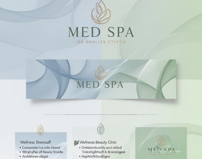
A good healthcare logo is simple, legible at small sizes, and communicates care and competence without clichés. Patients often see your logo first on a small screen, an insurance listing or a building sign, so fine detail and thin lettering disappear quickly.
Strong healthcare marks usually use a restrained color palette, clear typography and a symbol that relates to the specialty without copying the same stethoscope or generic cross used by hundreds of other practices. We also avoid protected symbols, such as the Red Cross emblem, that practices are not permitted to use.